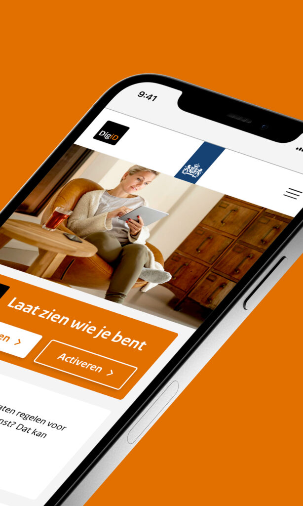
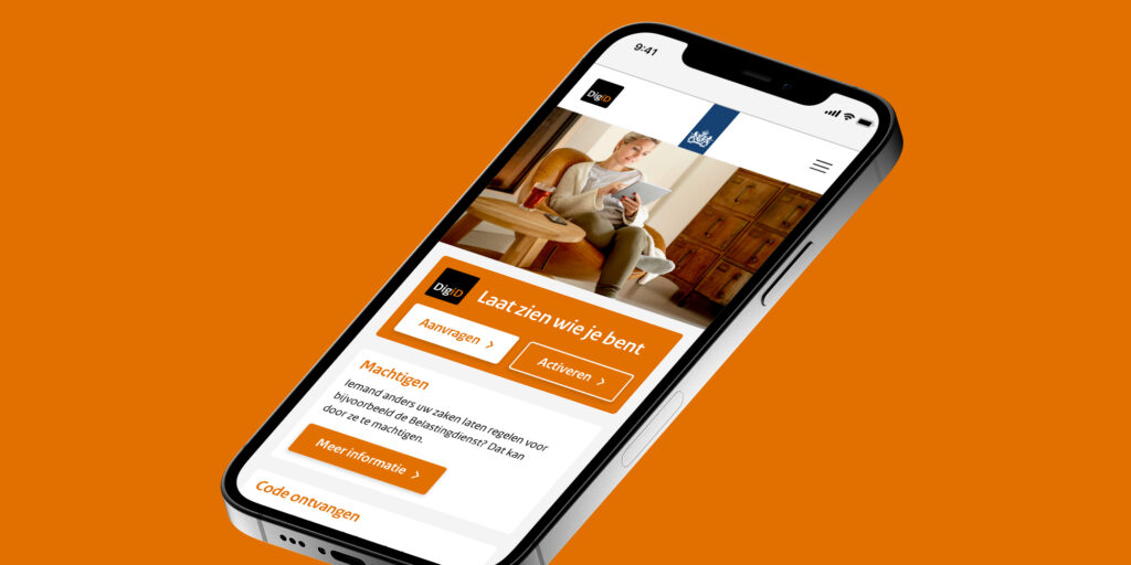
Website for 13 million users
- UX Design
- Web design
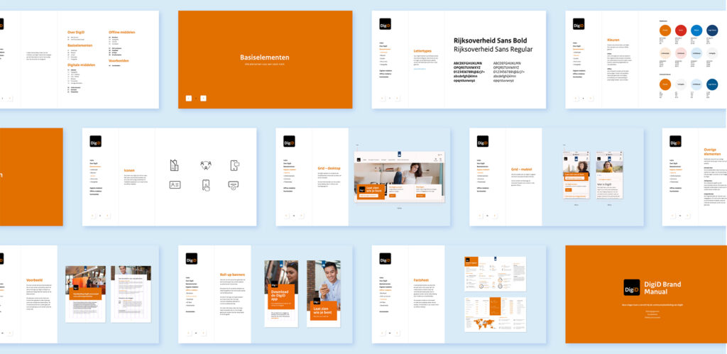
- Brand manual
- Communications
With more than 13 million users, DigiD is the online proof of identity that allows you to log on safely and easily to government and healthcare websites. The website was updated to provide users with greater support.
The challenge
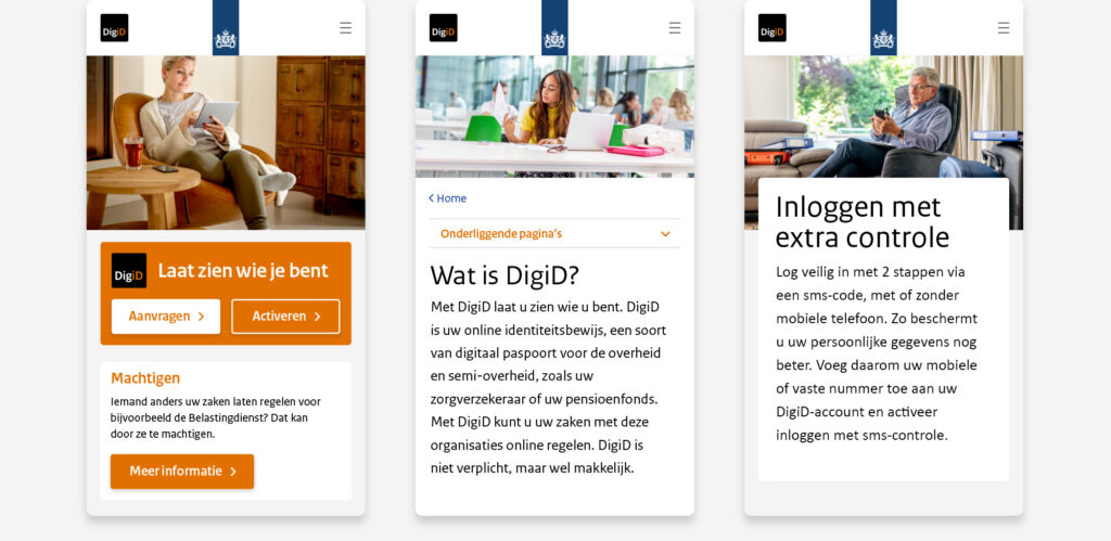
You can prove who you are with your DigiD. That means that 13 million users all needed to identify themselves in a single, clear communication concept. So Today looked for a way to show this diversity of users. From senior citizens managing their pensions to school pupils enrolling for further education. The DigiD website is for everyone.
Our role
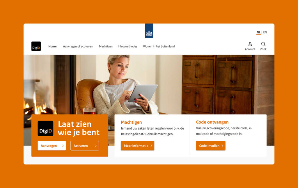
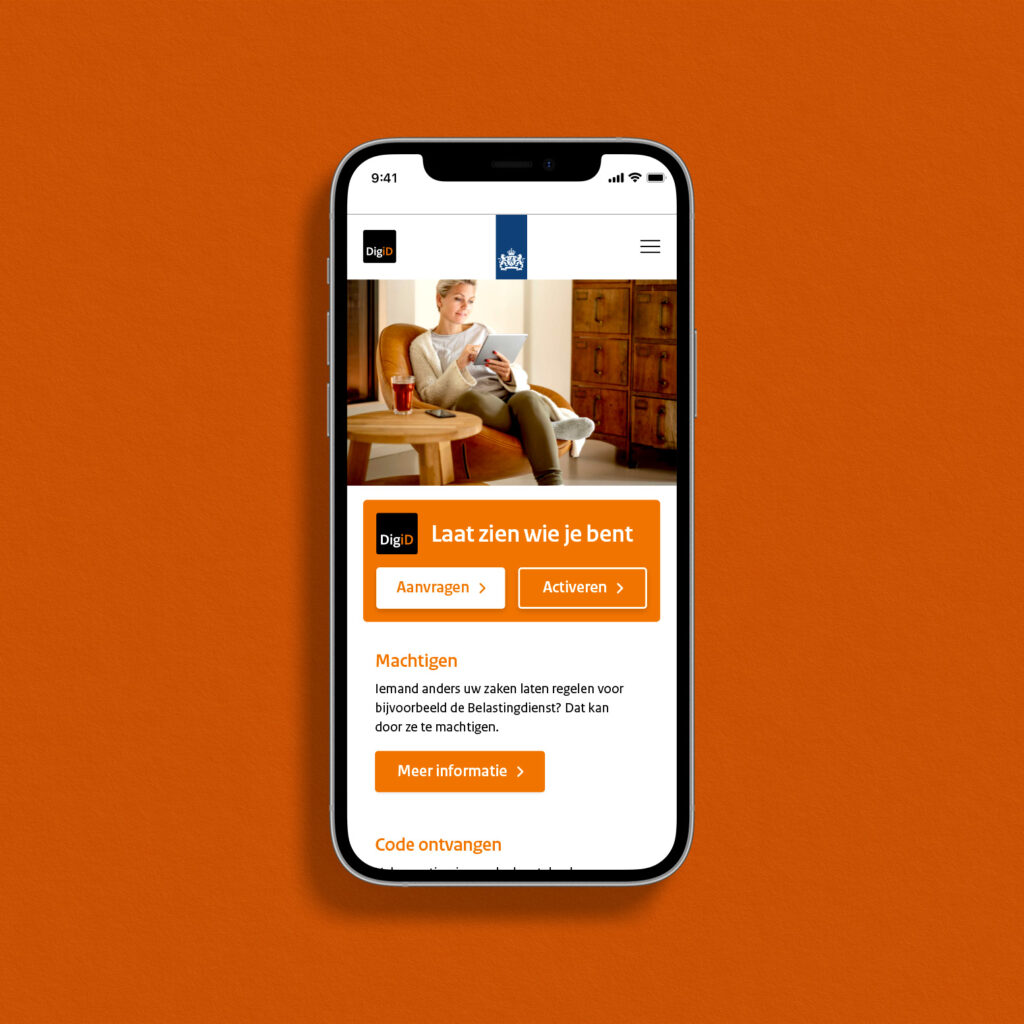
Most visitors use DigiD on their smartphones, but we also needed to think about the desktop experience for the elderly, the visually impaired, the low-literate and people with limited digital skills. Functional, accessible and user-friendly.
From whizzkids to the low literate
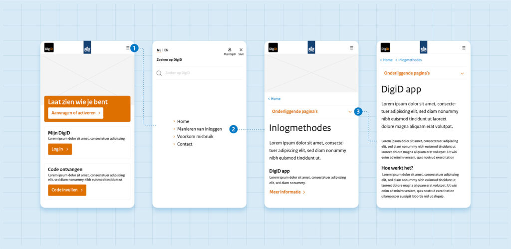
When updating the website, Today thought about how best to support all DigiD users. We reduced the total number of pages from 250 to 34. Everyone is carefully guided through the process thanks to a clear web structure, various tools, and step-by-step plans. This has hugely relieved pressure on the helpdesk.


More colour in the palette
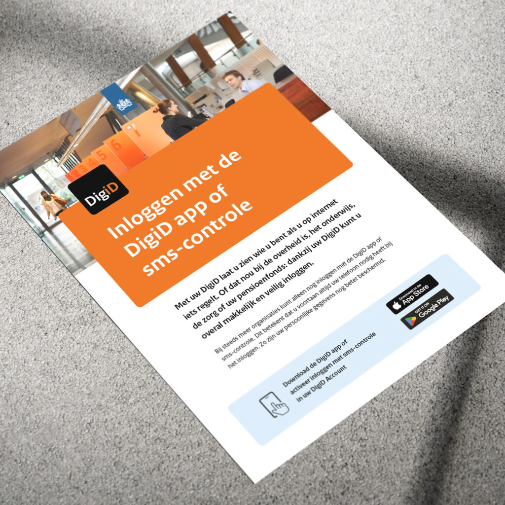
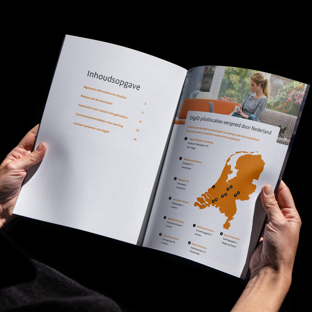
Orange is and remains the colour that everyone associates with DigiD. The style of the new website is fresh and open. This has been translated into a complete brand identity with several secondary colours, icons, illustrations and photos for online and offline communication options.

Next case

