
First aid for finding the right studies
- Brand identity
- Visual design
- Web design
- Photography
- Campaign
- Online communication
Studiekeuze123 is the official website for providing school pupils with guidance for their future studies. The site is a Ministry of Education, Culture and Science initiative in collaboration with students and educational institutions. Since the rebranding, traffic to Studiekeuze123.nl has gone up by 48% with more than 2 million visitors making their way to the website every year.
The challenge
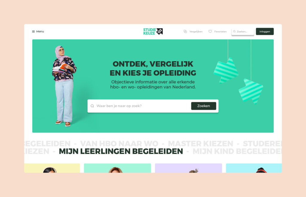
Design determines a large part of how a target audience experiences a brand. Young people often only give your brand a single chance. Today was asked to ensure that the new Studiekeuze123 website would answer the needs of prospective students, their parents, deans and other educators.
Our role
We explored a number of design concepts based on the strategic repositioning. After presenting these to the target audience, we went on to optimise one concept. The design is fresh, sassy and clear, favouring user experience on the platform.


Focus on tools
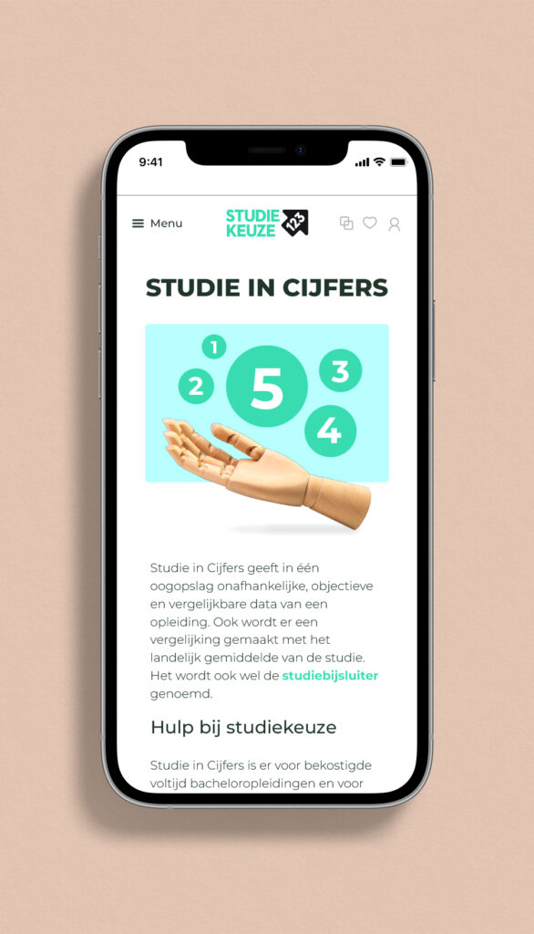
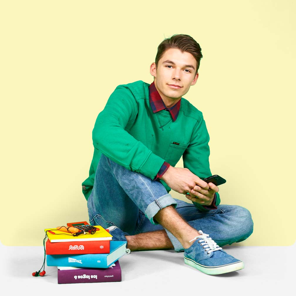
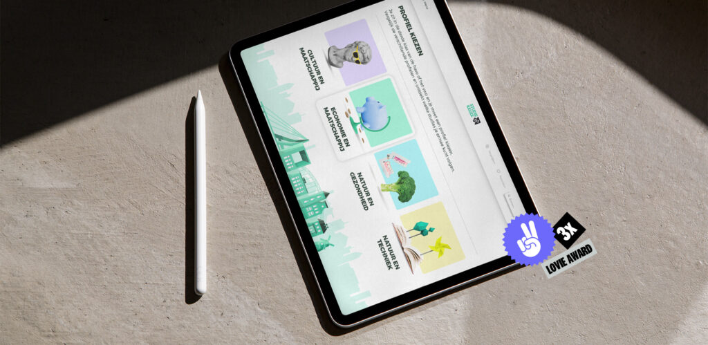
The website contains various tools to help students choose what study. These include a step-by-step plan, an aptitude test and an open-day calendar. We created a recognisable image representing the content of each tool. We also took care of the photography for Studiekeuze123. Prospective students, parents, deans and other educators are the face of the website.
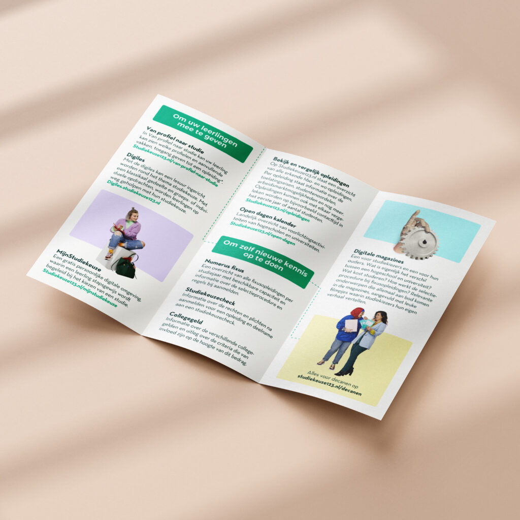
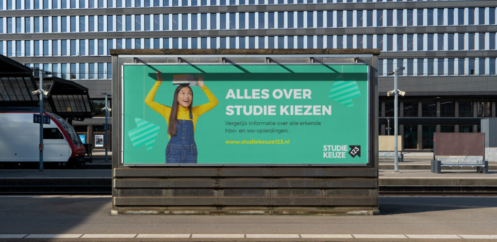

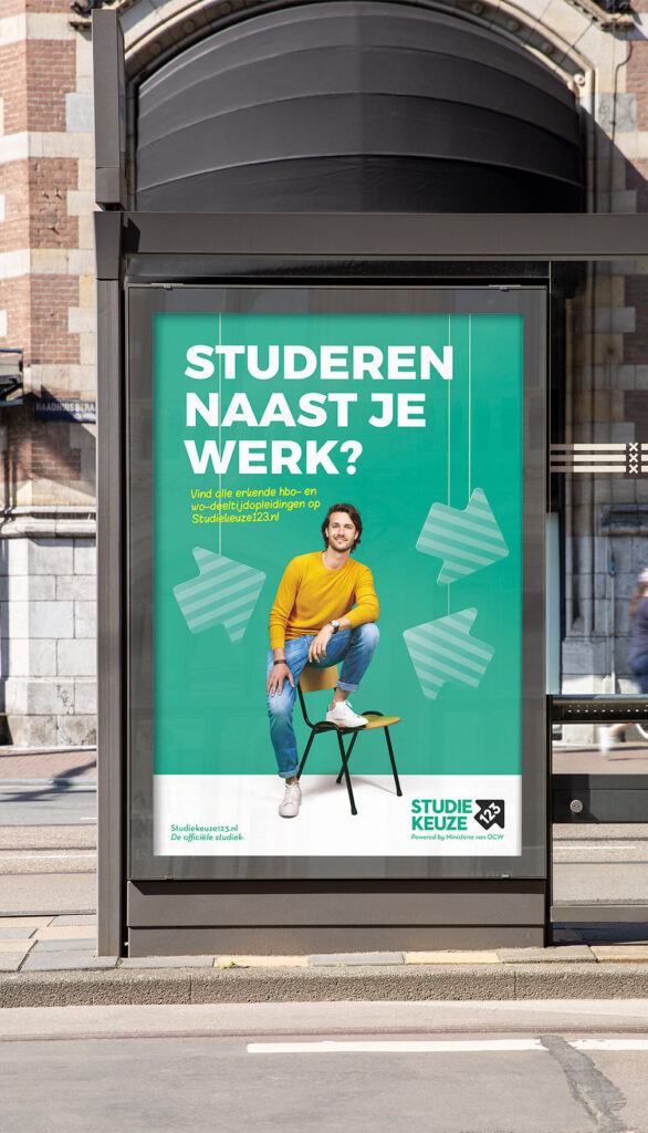
Studiekeuze123 is a foundation set up by students, the higher education sector and the Ministry of Education, Culture and Science to collect and share study guidance. All its employees have their own illustrated portrait on the website.
"The visual materials delivered were completely in line with our target audience and wishes. A usability test among prospective students confirmed this view."
Next case
